Showing posts with label Data Mining. Show all posts

Python Packages for Data Science

 In order to do data analysis in Python, you should know a little bit about the main packages relevant to analysis in Python. A Python library is a collection of functions and methods that allow you to perform lots of actions without writing any code. The libraries usually contain built-in modules providing different functionalities, which you can use directly. And there are extensive libraries, offering a broad range of facilities.


Infographic vector created by rawpixel dot com on freepik dot com

We have divided the Python data analysis libraries into three groups:
Scientific Computing Libraries
    i. Pandas offers data structure and tools for effective data manipulation and analysis. It provides fast axis to structured data. The primary instrument of Pandas is a two-dimensional table consisting of column and row labels, which are called a DataFrame. It is designed to provide easy indexing functionality.     ii. The Numpy library uses arrays for its inputs and outputs. It can be extended to objects for matrices, and with minor coding changes, developers can perform fast array processing.          iii. SciPy includes functions for some advanced math problems, as well as data visualization. Using data visualization methods is the best way to communicate with others, showing them meaningful results of analysis.

Libraries to create graphs, charts and maps
i. The Matplotlib package is the most well-known library for data visualization. It is great for making graphs and plots. The graphs are also highly customizable.

ii. Seaborn: It is based on Matplotlib. It's very easy to generate various plots such as heat maps, time series, and violin plots.

Machine Learning algorithms
i.  The Scikit-learn library contains tools for statistical modeling, including regression, classification, clustering and so on. This library is built on NumPy, SciPy and Matplotlib.

ii. StatsModels is also a Python module that allows users to explore data, estimate statistical models, and perform statistical tests.

Statistical Terms

A
Acceptance Error, Beta Error, Type II Error - An error made by wrongly accepting the null hypothesis when the null is really false.
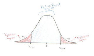
Acceptance Region - Opposite of the Rejection Region. It is better to call this the "Fail to Reject Region." In the case of a two-tailed hypothesis t-test, it is shaded in light blue on the picture below. If the test statistic falls between -tcritical and tcritical then we fail to reject the null hypothesis.
Adjusted R-Squared, R-Squared Adjusted - A version of R-Squared that has been adjusted for the number of predictors in the model. R-Squared tends to over estimate the strength of the association especially if the model has more than one independent variable.
Alpha [A, a ], Chosen Significance Level - The maximum amount of chance a statistician is willing to take that they will do not accept a null hypothesis that is true (Type I Error).
Alpha Error, Type I Error - An error made by wrongly rejecting the null hypothesis when the null is really true.
Alternative Hypothesis, Research Hypothesis - An hypothesis that does not conform to the one being tested, usually the opposite of the null hypothesis. Symbolized.
Analysis of Variance (ANOVA) - A test of differences between mean scores of two or more groups with one or more variables.
Approximation Curve, Curve Fitting - the general method for using a line or curve to estimate the relationship between two associated numerical variables.
Autocorrelation - This occurs when later variables in a time series are correlated with earlier variables.
B
Backward Elimination - A method of determining regression equation that starts with a regression equation that includes all independent variables and then remover variables that are not useful one at a time
Best Subsets Regression - A method of determining the regression equation used with statistical computer applications that allows the user to run multiple regression models using a specified number of independent variables. The computer will sort through all of the models and display the "best" subsets of all the models that were run. "Best" is typically identified by the highest value of R-squared. Other diagnostic statistics such as R-square adjusted and Cp are also displayed to help the user determine their best choice of a model.
Bell-Shaped Curve - A symmetrical curve. Looks like the cross-section of a bell.
Best Fit, Goodness of Fit - A model that is the best model for the given data.
Beta Error, Acceptance Error, Type II Error - An error made by wrongly accepting the null hypothesis when the null is really false.
Bivariate Association/ Relationship - The relationship between two variables only.
C
Cp Statistic - Cp measures the differences of a fitted regression model from a true model, along with the random error. When a regression model with p independent variables contains only random differences from a true model, the average value of Cp is (p+1), the number of parameters. Thus, in evaluating many alternative regression models, our goal is to find models whose Cp is close to or below (p+1).
Cook’s Distance: Cook’s distance combines leverages and studentized residuals into one overall measure of how unusual the predictor values and response are for each observation. Large values signify unusual observations. Geometrically, Cook’s distance is a measure of the distance between coefficients calculated with and without the ith observation. Cook and Weisberg suggest checking observations with Cook’s distance > F (.50, p, n-p), where F is a value from an F-distribution.
Coefficient of Determination – In general the coefficient of determination measures the amount of variation of the response variable that is explained by the predictor variable(s). The coefficient of simple determination is denoted by r-squared and the coefficient of multiple determination is denoted by R-squared.
Coefficient of Variation – The coefficient of variation, in regression, is the standard deviation of the predictor variable divided by the mean of the predictor variable. If this value is small, your variation in the y-values (predictor values) is nearly constant. This implies that the data are ill-conditioned.
Confidence Bands (Upper & Lower) - This is the range of the responses that can be expected for all of the appropriate inputs of X's. The upper confidence band is the highest value that the ÿh value is predicted to be. The lower confidence band is the lowest value predicted that ÿh could be.
Confidence Level - This is the amount of error allowed for the model (given as a percent or a).
Confidence Intervals - A range of values to estimate a value of a population parameter. Associated with the range of values is also the amount of confidence the researcher has in the estimate. For example, we might estimate the cost of a new space vehicle to be 35 million dollars. Assume that the confidence level is 95% and the margin of error is 5 million dollars. We say that we are 95% confident that the cost is between 30 and 40 million dollars.
Confidence Interval Bounds, Upper and Lower - The lower endpoint on a confidence interval is called the lower bound or lower limit. The lower bound is the point estimate minus the margin of error. The upper bound is the point estimate plus the margin of error.
Correlation - The amount of association between two or more items. In these tutorials, correlation will refer to the amount of association between two or more numerical variables.
Correlation Coefficients, Pearson’s Sample Correlation Coefficient, r - Measures the strength of linear association between two numerical variables.
Correlation Matrix - A table that shows all pairs of correlations coefficients for a set of variables.
Correlation Ratio- A kind of correlation used when the relation between two variables is assumed to be curvilinear (i.e. not linear).
Curve Fitting, Approximation Curve - the general method for using a line or curve to estimate the relationship between two associated numerical variables.
D
Degrees of Freedom, df, - The number of values that can vary independently of one another. For example, if you have a sample of size n that is used to evaluate one parameter, then there are n-1 degrees of freedom.
Dependent Variable, Response Variable, Output Variable - The variable in correlation or regression that cannot be controlled or manipulated. The variable that "depends" on the values of one or more variables. In math, y frequently represents the dependent variable.
DFITS, DFFITS: Combines leverage and studentized residual (deleted t residuals) into one overall measure of how unusual an observation is. DFITS is the difference between the fitted values calculated with and without the ith observation, and scaled by stdev (Ŷi). Belseley, Kuh, and Welsch suggest that observations with DFITS >2Ö(p/n) should be considered as unusual
Dummy Variable, Indicator Variable - A variable used to code the categories of a measurement. Usually, 1 indicates the presence of an attribute and 0 indicates the absence of an attribute. Example: If the measurement variable is cost of space flight vehicle then the vehicle might be manned or unmanned. Let the dummy variable be 1 if the vehicle is manned and 2 if it is unmanned. Note: Dummy variable coding can be used for more than 2 categories.
E
Efficiency, Efficient Estimator - It is a measure of the variance of an estimate's sampling distribution; the smaller the variance, the better the estimator.
Error - In general, the error difference in the observed and estimated value of a parameter.
Errors, Residuals - In regression analysis, the error is the difference in the observed Y values and the predicted Y values that occur from using the regression model. See the graph below.
Error, Specification (Specification error) - A mistake made when specifying which model to use in the regression analysis. A common specification error involves including a irrelevant variable and leaving out an important variable.
F
F (F test statistic) - This is the test statistic for whenever conducting an analysis of variance.
Fits, Fitted Values, Predicted Values - The Fits are the predicted values found by substituting the original values for the independent variable(s) into the regression equation. The name "fit" refers to how well the observed data matches the relationship specified in the model.
Forward Selection - A frequently available option of statistical software applications. A method of determining the regression equation by adding variables to the regression equation until the addition of new variables does not appear to be worthwhile.
F-test: An F-test is usually a ratio of two numbers, where each number estimates a variance. An F-test is used in the test of equality of two populations. An F-test is also used in analysis of variance, where it tests the hypothesis of equality of means for two or more groups. For instance, in an ANOVA test, the F statistic is usually a ratio of the Mean Square for the effect of interest and Mean Square Error. The F-statistic is very large when MS for the factor is much larger than the MS for error. In such cases, reject the null hypothesis that group means are equal. The p-value helps to determine statistical significance of the F-statistic.
G
General Linear Model (GLM) - A full range of methods used to study linear relations between one continuous dependent variable and one or more independent variables, whether continuous or categorical. “General” means the kind of variable is not specified. Examples include Regression and ANOVA.
H
Heteroscedasticity - Non constant error variance. Hetero = different; scedasticity = tendency to scatter.
Hierarchical Regression Analysis - A multiple regression analysis method in which the researcher, not a computer program, determines the order that the variables are entered into and removed from the regression equation. Perhaps the researcher has experience that leads him/her to believe certain variables should be included in the model and in what order.
Homoscedasticity - Constant error variance. Homo = same; scedasticity = tendency to scatter.
Hypothesis Testing - This is the common approach to determining the statistical significance of findings.
I
Independent Variable, Explanatory Variable, Predictor Variable, Input Variable - The variable in correlation or regression that can be controlled or manipulated. In math, x frequently represents the independent variable.
Influential Observation - An observation that has a large effect on the regression equation. Note: Outliers and leverage points may be influential observations, but influential observations are usually outliers and leverage points.
Intercorrelation - Correlation between variables that are all independent (no dependent variables involved).
L
Least Squares Regression - Regression analysis method which minimizes the sum of the square of the error as the criterion to fit the data. This can refer to linear or curvilinear regression.
Leverages, Leverage Points - An extreme value in the independent (explanatory) variable(s). Compared with an outlier, which is an extreme value in the dependent (response) variable.
Linear Correlation- A relationship between the independent and dependent data, that whenever plotted forms a straight line.
Linear Regression - Typically when regression is used without qualification, the type of regression is assumed to be linear regression. This is the method of finding a linear model for the dependent variable based on the independent variable(s).
M
Mean Square Residual, Mean Square Error (MSE) - A measure of variability of the data around the regression line or surface.
Measurement Error (Error, Measurement) - inaccurate results due to flaw(s) in the measuring instrument.
Multicollinearity, Collinearity - The case when two or more independent variables are highly correlated. The occurrence of multicollinearity can cause difficulties in multiple regression. If the independent variables are interrelated, then it may be difficult or impossible to find the specific effect of only one independent variable.
Multiple Correlation Coefficient, R - A measure of the amount of correlation between more than two variables. As in multiple regression, one variable is the dependent variable and the others are independent variables. The positive square root of R-squared.
Multiple Correlation - Correlation with one dependent variable and two or more independent variables. Measures the combined influences of the independent variables on the dependent. gives the proportion of the variance in the dependent variable that can be explained by the action of all the independent variables taken together.
Multiple Correlation Matrices - A table of correlation coefficients that shows all pairs of correlations of all the parameters with in the sample.
Multiple Correlation Plots - A collection of scatterplots showing the relationship between the variables of interest.
Multiple R - That is the name MS Excel uses for the Multiple Correlation Coefficient, R.
Multiple Regression, Multiple Linear Regression - A method of regression analysis that uses more than one independent (explanatory) variable(s) to predict a single dependent (response) variable. Note: The coefficients for any particular explanatory variable is an estimate of the effect that variable has on the response variable while holding constant the effects of the other predictor variables. “Multiple” means two or more independent variables. Unless specified otherwise, “Multiple Regression” generally refers to “Linear” Multiple Regression.
Multiple Regression Analysis (MRA) - Statistical methods for evaluation the effects of more than one independent variable on one dependent variable.
N
Negative Correlation- This occurs whenever the independent variable increases and the dependent variable decreases. This is also called a negative relationship.
Nonadditivity - A statement used to describe a relation when the addition of the separate effects do not add up to the total effect.
Nonlinearity - The events are not the same as their causes.
Nonlinear Relationship - A relationship between two variables for which the points in the corresponding scatterplot do not fall in approximately a straight line. Nonlinearity may occur because there is not a defined relationship between the variables as in the first figure below, or because there is a specific curvilinear relationship. See the parabolic relationship shown in the second graph below.
Normality Plot, Normal Probability Plot - A graphical representation of a data set used to determine if the sample represents an approximately normal population. A graph from Minitab is shown below. The sample data is on the x-axis and the probability of the occurrence of that value assuming a normal distribution is on the y-axis. If the resulting graph is approximately a straight line, then the distribution is approximately normal. There are statistical hypothesis tests for normality as well.
Null Hypothesis, - This is the hypothesis that two or more variables are not related and the researcher wants to reject.
O
Outlier - An extreme value in the dependent (response) variable. Compared with a leverage point, which is an extreme value in the independent (explanatory) variables.
P
Partial Correlation - Correlation between two variables given that the linear effect of one or more other variables has been controlled. Example. r12.3 is the correlation of variables one and two given that variable three has been controlled.
Partial Correlation Coefficients - This is the square root of a coefficient of partial determination. It is given the same sign as that of the corresponding regression coefficient in the fitted regression function.
Partial Determination Coefficients- This measures the marginal contribution of one X variable when all others are already included in the model. In contrast, the coefficient of multiple determination, , measures the proportion reduction in the variation of Y achieved by the introduction of the entire set of X variables considered in the model.
Partial Regression Coefficient, Partials - In a multiple regression equation, the coefficients of the independent variables are called partial regression coefficients because each coefficient tells only how the dependent variable varies with the selected independent variable.
Pearson’s Sample Correlation Coefficient, r - Measures the strength of linear association between two numerical variables.
Population - A group of people that one whishes to describe or generalize about.
Predictor Variable, Independent Variable, Explanatory Variable, Input Variable - The variable in correlation or regression that can be controlled or manipulated. In math, x frequently represents the independent variable.
Prediction Equation - An equation that predicts the value of one variable on the basis of knowing the value of one or more variables. Note: Formally prediction equation is a regression equation that does not include an error term.
Prediction Interval - In regression analysis, a range of values that estimate the value of the dependent variable for given values of one or more independent variables. Comparing prediction intervals with confidence intervals: prediction intervals estimate a random value, while confidence intervals estimate population parameters.
Population Parameter, Parameter - A measurement used to quantify a characteristic of the population. Even when the word population is not used with parameter, the term refers to the population. Example: The population mean is a measure of central tendency of the population. The population parametric is usually unknown.
Proportional Reduction of Error (PRE) - A measure of association that calculates how much more you can reduce your error in the predication of y if you know x, then when you do not know x. Pearson’s r is not a PRE, but r-squared is a PRE.
Positive Correlation- This relationship occurs whenever the dependent variable increases as the independent variable increases
P-values, Observed Significance Level - The probability of making a Type I error. (i.e. given that the null is true, the probability of getting a data set like the one we have or one more extreme in the direction of the alternative.)
R
r, Correlation Coefficients, Pearson’s r - Measures the strength of linear association between two numerical variables.
R, Coefficient of Multiple Correlation - A measure of the amount of correlation between more than two variables. As in multiple regression, one variable is the dependent variable and the others are independent variables. The positive square root of R-squared.
r2 , r-squared (r-sq.), Coefficient of Simple Determination - The percent of the variance in the dependent variable that can be explained by of the independent variable.
R-squared, Coefficient of Multiple Determination - The percent of the variance in the dependent variable that can be explained by all of the independent variables taken together.
R-Squared Adjusted (R-sq. adj.), Adjusted R-Squared - A version of R-Squared that has been adjusted for the number of predictors in the model. R-Squared tends to over estimate the strength of the association especially if the model has more than one independent variable.
Range of Predictability, Region of Predictability - The range of independent variable(s) for which the regression model is considered to be a good predictor of the dependent variable. For example, if you want to predict the cost of a new space vehicle subsystem based on the weight, and all of the input data subsystem weights all range from 100 to 200 pounds. You could not expect the resulting model to provide good predictions for a subsystem that weighs 3000 pounds.
Regression Analysis, Statistical Regression, Regression - Methods of establishing an equation to explain or predict the variability of a dependent variable using information about one or more independent variables. The equation is often represented by a regression line, which is the straight line that comes closest to approximating a distribution of points in a scatter plot. When "regression" is used without any qualification it refers to “linear” regression.
Regression Artifact, Regression Effect - An artificial result due to statistical regression or regression toward the mean.
Regression Coefficient, Regression Weight - In a regression equation the number in front of an independent variable. For example, if the regression equation is Y = mx + b then m is the regression coefficient of the x-variable. The regression coefficient estimates the effect of the independent variable(s) on the dependent variable. (Compare with Partial Regression Coefficients)
Regression Constant - Unless specified otherwise, the regression constant is the intercept in the regression equation.
Regression Equation - An algebraic equation that models the relationship between two (or more) variables. If the equation is Y = a + bX + e, then Y is the dependent variable, X is the independent variable, b is the coefficient of X, and a is the intercept, and e is the error term (See Prediction Equation).
Regression Line, Trend Line - When the best fitting regression model is a straight line, that line is called a regression “line.” Ordinary Least Squares method is usually used for computing the regression line.
Regression Model - An equation used to describe the relationship between a continuous dependent variable, an independent variable or variables, and an error term.
Regression Plane - When the regression model has two independent variables, then a plane represents the relationship between the variables two-dimensional. Example: z = a + bx + cy
Regression SS (also SSR or SSregression) - The sum of squares that is explained by the regression equation. Analogous to between-groups sum of squares in analysis of variance.
Regression Toward the Mean - The type of bias described by Francis Galton, a 19th century researcher. A tendency for those who score high on any measure to get somewhat lower scores on a subsequent measure of the same thing- or, conversely, for someone who has scored very low on some measure to get a somewhat higher score the next time the same thing is measured. Knowing how much regression toward the mean there is for a particular pair of variables gives you a prediction. If there is very little regression, you can predict quite well. If there is a great deal of regression, you can predict poorly if at all.
Regression Weight, Regression Coefficient - In a regression equation the number in front of an independent variable. For example, if the regression equation is Y = mx + b then m is the regression coefficient of the x-variable. The regression coefficient estimates the effect of the independent variable(s) on the dependent variable. (Compare with Partial Regression Coefficients)
Regress On - The dependent variable is “regressed on” the independent variable(s). We will regress the cost of the space vehicle (based) on the weight of the vehicle. If x predicts y, then y is regressed on x. (i.e. Regress the dependent variable on the independent. Response variable is regressed on the explanatory variable.)
Rejection Region - The area in the tail(s) of the sampling distribution for a test statistic. The figure below shows the Rejection Region in red.
Residuals, Errors - The amount of variation on the dependent variable not explained by the independent variable.
Response Variable- Same as the independent variable.
Robust - Said of a statistic that remains useful even when one or more of the assumptions is violated.
S
Sample - A group of subjects selected from a larger group, the population.
Sample Statistic, Statistic - A measurement used to quantify a characteristic of the Sample. Even when the word sample is not used, the term statistic refers to the sample. Example: The sample mean is a measure of central tendency of the sample (see Population Parametric).
Sampling Error, Sampling Variability, Random Error - The estimation of the expected differences between the sample statistic and the population parameter.
Sampling Distribution - It is all possible values of a statistic and their probabilities of occurring for a sample of a particular size.
Scaling - expresses the centered observation in the units of the standard deviation of the observations.
Scatter Diagram, Scattergram, Scatter Plot - The pattern of points due to plotting two variables on a graph.
Significance - The degree to which a researcher’s finding is meaningful or important.
Significance Level - there are two types of significance levels, the observed significance level (alpha) and the chosen significance level (p-value). The lower the probability the greater the statistical significance, called alpha level.
Simple Linear Regression - A form of regression analysis, which has only one independent variable.
Slope - The rate at which the line or curve rises or falls when covering a given horizontal distance.
Spearman Correlation Coefficient (rho), Rank-Difference Correlation, rs. - A statistical measure of the amount of monotonic relationship between two variables that are arranged in rank order.
Specification error (Error, Specification) - A mistake made when specifying which model to use in the regression analysis. A common specification error involves including a irrelevant variable and leaving out an important variable.
Standard Deviation - A statistic that shows the square root of the squared distance that the data points are from the mean.
Standardized Measure of Scale - Any statistic that allows comparisons between things measured on different scales. Example: percent, standard deviations and z-scores
Standardized Regression Coefficient - Regression Coefficients which have been standardized in order to better make comparisons between the regression coefficients. This is particularly helpful when different independent variables have different units.
Standardized Regression Model - This is the regression model used after centering and scaling of the dependent variable and independent variables.
Standardized residuals - Standardized residuals are of the form (residual) / (square root of the Mean Square Error). Standardized residuals have variance 1. If the standardized residual is larger than 2, then it is usually considered large.
Standard Error, Standard Error of the Regression, Standard Error of the Mean, Standard Error of the Estimate - In regression the standard error of the estimate is the standard deviation of the observed y-values about the predicted y-values. In general, the standard error is a measure of sampling error. Standard error refers to error in estimates resulting from random fluctuations in samples. The standard error is the standard deviation of the sampling distribution of a statistic. Typically the smaller the standard error, the better the sample statistic estimates of the population parameter. As N goes up, so does standard error.
Statistical Significance - Statistical significance does not necessarily mean that the result is clinically or practically important. For example, a clinical trial might result is a statistically significant finding (at the 5% level) that shows the difference in the average cholesterol rating for people taking drug A is lower than that of those taking drug B. However, drug A may only lower the cholesterol by 2 units more than drug B which is probably not a difference that is clinically important to the people taking the drug. Note: Large sample sizes can lead to results that are statistically significant that would otherwise be considered inconsequential.
Stepwise Regression - A method of regression analysis where independent variables are added and removed in order to find the best model. Stepwise regression combines the methods of backward elimination and forward selection.
Strength of Association, Strength of Effect Index - The degree of relationship between two (or more) variables. One example is R-squared, which measures the proportion of variability in a dependent variable explained by the independent variable(s).
Studentized Residuals: The studentized residual has the form of error/standard deviation of the error. Studentized residuals have constant variance when the model is appropraite.
T
Transformations - This is a method of changing all the values of a variable by using some mathematical operation.
U
Unbiased Estimator - A sample statistic that is free from systemic bias.
V
Variance Inflation Factor (VIF) - A statistics used to measuring the possible collinearity of the explanatory variables.
W
Weighted Least Squares - A method of regression used to take into account the non constant variance. The variables are multiples by a particular number (weights). It is typical to choose weights that are the inverse of the pure error variance in the response. (Minitab, page 2-7.) This choice gives large variances relatively small weights and visa versa.
Y
Y-intercept - is the point where a regressin line intersects the y axis.

Database Marketing


“Good information is essential for fact based decision – making”
In the good old days, many “savvy” corporate CEOs and other assorted head honchos in the public and private sector routinely made critical decisions by the seat of their pants. They relied on their experience, their intuition and their “gut” to determine a course of action that could make or break the organization. Sometimes they were right, sometimes they were wrong, and sometimes the organization went down the drain. Today, more and more of these C-level decision-makers are turning to analytics for help in the decision-making process. The stakes are just too high and the competition is just too fierce to rely on your “gut.” Instead of shouting, “show me the money,” savvy CEOs are now shouting, “show me the data and the statistical analysis first . . . and then I’ll show our shareholders the money.” The trend toward data-based decision-making is being driven, of course, by astronomical increases in data, statistical modeling capabilities and computing power. Analytics is defined as “the extensive use of data, statistical and quantitative analysis, explanatory and predictive models, and fact-based management to drive decisions and actions.”That encompasses the work of hundreds of thousands if not millions of “analysts” of all stripes around the world.
Using and evaluating data are important steps to the improvement process.  Data are any information about an organization that can be gathered, reviewed and analyzed in order to produce a useful knowledge.  Looking at the combination of pieces of knowledge and facts together, whether it has to do with demographics, achievement, test scores, or climate, helps an organization formulate hypotheses to decide how best to use the information.  Basing educated guesses upon data are the beginning steps in creating an effective and efficient improvement process.  One can focus their attention on specific indicators that are being displayed by the data, and identify priority areas in which they direct their focus.  Once priority areas are narrowed down realistic goals are made and moving into action becomes the next step.  Reviewing data, forming hypotheses, and creating action plans helps to move toward the goal of creating positive changes.


The following is a list of the 23 essential techniques used in database marketing. Anyone who works in marketing today has to be familiar with and be able to use all of these methods.
1) LTV. Customer Lifetime Value can be calculated in any industry, business to business or business to consumer. It is used to direct marketing strategy. In the early days of database marketing few knew how to calculate it or how to use it. Today it is widely practiced. It is powerful and it works.
2) RFM (Recency, Frequency, Monetary Analysis) is a highly successful way of predicting which customers will respond to promotions. It has been around for fifty years, but even today many marketers do not understand it or use it properly. It is a versatile tool that has helped to make database marketing successful.
3) Customer Communications. Personalized customer communications, based on data in a database, can be shown (using tests and controls) to increase customer retention, loyalty, cross sales, up sales and referrals. They are effective and they work. They are the principal reason why you build a marketing database.
4) Appended Data. It is possible today to append data to any name and address file to learn age, income, home value, home ownership, presence of children, length of residence, and about forty other valuable pieces of information about any household. This information can be used to create customer segments, and guide strategy designed to create powerful customer communications. Similar information can be appended to business to business files: SIC code, number of employees and annual sales.
5) Predictive Models. Using appended demographic and behavioral data, it is possible to create models that predict, accurately, which customers are most likely to defect, and which customers are most likely to respond to new initiatives. Modeling, combined with customer communications, can be very powerful technique that can increase response and reduce your attrition rate.
6) Relational Databases. Putting customer databases in a relational form makes it possible to store an unlimited amount of information about any customer or prospect, and retrieve it in an instant in a hundred different ways. Relational databases are essential to modern database marketing. Marketers need to understand the principles involved.
7) Caller ID. Set up originally as a call routing device, Caller ID linked to a customer marketing database permits customer service to get a customer’s complete record up on the screen before taking a call. As a result, the CSR can speak to the customer as if she knew her, bonding with her and building close rapport. This helps deliver on the promise of database marketing.
8) Websites. The web has revolutionized database marketing. A modern website, with cookies can do almost everything that a live operator can do, and much more, showing and enabling customers to print pictures of the product, maps, instructions, background information and details. Web sites are not wonderful at selling. They are a tremendous research tool and customer bonding and ordering tool. No database marketer can be really successful without a personalized website with cookies.
9) Email. Despite the SPAM, emails have emerged as a powerful database marketing tool. The ability to contact customers immediately “Your product was shipped today. Here is the tracking number…” makes for vastly improved customer relationships leading to retention and increased sales.
10) Tests and Controls. Since 1980 marketers were sending out direct mail, and measuring the response to each campaign. Today, we can use our database to measure much more. Setting aside customers in a control group, we can measure with pin point accuracy the short and long term effect of any marketing initiative.
11) Loyalty Programs. Most customers are delighted to participate in well designed loyalty programs. Airlines have been outstandingly successful in these programs. Their use has spread to supermarkets, hotels, retail stores, and a variety of industries. They are part of the mix of retention building services that database marketing has made possible.
12) Analytical Software. It used to be that after a campaign, you got canned printed reports showing what happened. Today, marketers have very sophisticated analytical software linked to their database so that each analyst can do any type of standard or ad hoc report before, during and after a campaign, with the results printed on his PC printer. We have “hands on” marketing which has made database marketing very powerful.
13) Web Access to the database. Today the marketing database is in a relational format on a server which is accessed online over the web by anyone in the company, from any location. Instead of a couple of analysts working with the data, it is available to management, sales, customer service, marketing, and market research. Web access has made marketing databases a useful tool throughout the enterprise.
14) Rented Lists. In the past, most companies kept their customer lists strictly private. Today, most lists are shared, exchanged or rented. Sharing of lists created the catalog industry, and has spurred the growth of hundreds of other direct response industries.
15) Campaign Management Software. Direct marketing campaigns used to be generated by memoranda to a service bureau: “Select these groups, divide them into these segments with these codes, and fax me the counts”. The process of getting the mail out the door took three to six weeks. Today, marketers have campaign management software linked to their database so that they can do the planning and the actual selections themselves in an afternoon. It cuts weeks off of the direct mail time, resulting in higher response rates.
16) Profitability Analysis. We used to know that some customers were more profitable to us than others, but it was hard to measure. Today banks, supermarkets, insurance firms, business to business enterprises, and many others can compute the monthly profitability of each customer. They have discovered that many customers are unprofitable. As a result they have changed their marketing and pricing strategy to increase their profits.
17) Customer Segmentation. There used to be so few customers that sales and marketers could keep needed information about them in their heads. Today, companies have many more customers – some in the millions. A database is needed to store the information. To develop marketing strategies for all these customers, you have to divide them into segments usually based on demographics and behavior. Success comes from creating useful segments, and developing customer marketing strategies for each segment.
18) Multi-channel marketing. Customers buy through multiple channels: retail, catalog, and web. We have learned that multi-channel customers buy more than single channel buyers. To be successful, you need a database that provides a 360 degree picture of your customer, coupled with strategies that recognize and communicate personally with the customer when she shows up in any of the three channels.
19) Treating customers differently. All businesses have Gold customers – a small percentage that provides 80% of your revenue and profit. With a marketing database, you can identify these Gold customers. Then you develop programs designed to retain them. You use resources that you could not afford to spend on all of your customers. Profits come from working to retain the best, and encouraging others to move up to higher status levels.
20) Next Best Product. The database is used to determine what customers in each segment normally buy. From this, you can determine anomalies: customers who are not buying what the others are buying (usually because they are buying this product from somewhere else). This is their Next Best Product. The NBP is put into the customer database record and used by customer service and sales in communicating with customers. 
21) Penetration Analysis. Using a database and on line analytical software, marketers can do their own penetration analysis. What percent of sales do we have in each zip code, or SIC code, or income level, or age group? This is a versatile tool that can help you to locate retail stores, place advertising, and direct your sales force.
22) Cluster Coding. In many industries, using clusters with penetration analysis can help you identify who is buying your products, and who isn’t. It can be a creative tool to use in improving your marketing and sales.
23) Status Levels. The airlines started it: Platinum, Gold, and Silver. It has spread to other industries. Customers now understand their status, and work to move up to a higher level. Companies provide special benefits, rewards and services for higher status customers. In a democracy, it is an egalitarian method of customer differentiation which assists in building customer loyalty and company profits.
If you are not familiar with and using all 23 techniques in your work, you may not be getting the level of customer retention, cross sales, up sales, referrals and profits that others are getting.

Pareto Analysis

Pareto Analysis: When faced with a range of issues, it is often difficult to know which to work on first. To resolve this problem, the most useful thing to do is to apply Pareto's rule. It can be described as the 80/20 rule applied to quality-control.  The 80/20 rule was originally formalized by Vilifredo Pareto, after studying the distribution of wealth.  He noticed that about 80% of wealth was held by about 20% of the population. Several years later, Joseph Juran applied the principle to quality-control, and Pareto Analysis was born. Pareto Analysis essentially states that 80% of quality problems in the end product or service are caused by 20% of the problems in the production or service processes. Once these problems are identified, the 20% that are causing 80% of the problems can be addressed and remedied, thus efficiently obtaining quality.
It can be used in a technical sense to try and improve a process by eliminating defects.  It can be used in a human resources to try and find the time wasters in different work environment.  It can be used in finding out what the biggest hurdle may be to achieving a goal.
Use of Pareto Analysis:
An example of where one might use a Pareto Analysis might be if you were running a restaurant. Approximately 20% of the menu items would account for 80% of the profit taken in by the restaurant.  By using a Pareto Analysis, the restaurateur would know which menu items to focus his business around. In the manufacturing of clothing if one monitores the returns of clothing with a Pareto Analysis, the manufacturer would be able to find the 20% of the root causes behind 80% of the returns.  A third example can be seen in the semiconductor industry. Again, a manufacturing process will be looked at but this time the Pareto Analysis will be used inline to determine defect causes during inspection.  Using a Pareto Analysis, engineering can decide which defects warrant the most attention, cut costs, and improve the end result.

 A Pareto chart has the following objectives: 
-  Separate the few major problems from the many possible problems so you can focus your improvement    efforts. 
-  Arrange data according to priority or importance.
- Determine which problems are most important using data, not perceptions. 

Benefits of Pareto Analysis
Pareto diagrams: 
- Solves efficiently a problem by the identification and the hierarchisation, according to their importance, of the main causes of the faults. 
- Sets the priorities for many practical applications. Some examples are: process improvement efforts for increased unit readiness, customer needs, suppliers, investment opportunities. 
- Shows where to focus efforts. 
- Allows better use of limited resources. 

A Pareto Diagram is a good tool to use when the process investigated produces data that are broken down into categories and you can count the number of times each category occurs. A Pareto diagram puts data in a hierarchical order, which allows the most significant problems to be corrected first. The Pareto analysis technique is used primarily to identify and evaluate nonconformities, although it can summarize all types of data. It is the perhaps the diagram most often used in management presentations.

The Pareto chart
A Pareto chart is a graphical representation that displays data in order of priority. It can be a powerful tool for identifying the relative importance of causes, most of which arise from only a few of the processes, hence the 80:20 rule. Pareto Analysis is used to focus problem solving activities, so that areas creating most of the issues and difficulties are addressed first.
How to Use It
In conducting a Pareto Analysis, the first phase is concerned with identifying possible causes of inferior quality.  This can be done through brainstorming, focus groups, surveys, or any other method appropriate to the given business.  The goal is to obtain actionable items that result in inferior quality.  For example, if I manufacture glass windows, and some of them must be returned due to glass chips and cracks, I may identify the following four possible causes of the glass inconsistencies (inferior quality): poor production process, mishandling at the factory, faulty packaging, and problems in transit.  Each of these items can be acted upon, and in our situation, we will assume they are truly possible causes of inferior quality.  Once the actionable items are identified, we can move on to phase two.
The second phase is comprised of picking an appropriate time period over which we would like to conduct our analysis and then conducting the assessment.  The goal here is to obtain a statistical sampling that is representative of the time period over which we are trying to improve quality.  Some quality-control measures may be intentionally applied to seasonal, biannual, or some other specified time period, depending on the business.  Some businesses may care about the quality and increased investment of obtaining that quality at certain times of the year, but not at others.  The objective is to make sure that the measured time period accurately represents the time period over which the quality-control measures will be enacted.  Once the time period is chosen, the quality problems are tallied under the causes of inferior quality that were identified in the first phase.  In our example, each time we received a return for the reason of ‘faulty packaging,’ we would add one to the tally for that cause.  Each time we incurred an inconsistency for the reason of ‘mishandling at the factory,’ we would add one to the tally for that cause.  This process would continue until our predefined time period had elapsed, after which we would subtotal the results and move on to the third phase.
Phase three is summarizing and graphing the results obtained in the previous phases.  After subtotaling the numbers for each of the causes of inferior quality, those numbers are summed to obtain the total number of defects.  Then, in order to acquire the percentage of each cause in relation to the total number of defects, each subtotaled number is divided by the total number of defects and multiplied by 100.  After these percentages are obtained, they can be graphed in a histogram, with the causes of poor quality listed on the x-axis, and the percentages of their occurrence listed on the y-axis.  The causes are listed from left to right, with the most often occurring cause listed on the furthest left, the next most often occurring cause listed next to it, and so on.  Finally, in order to make the histogram more easily interpretable, a cumulative line graph can be placed over the existing bars.  This histogram is called a Pareto Chart.  Now we are ready for phase four.
The fourth and final phase is concerned with interpreting and applying the graphed results.  The overlaid line graph helps us in this process, as it shows the percentage of the total defects that we dispose of as we perform the actionable items, from left to right.  This is where the 80/20 rule comes into play, as you will most often notice that about 80% of the defective products are caused by about 20% of the possible defect causes.  When actually implementing solutions, however, it is recommended that after the leftmost quality problem is dealt with, that another Pareto Analysis is conducted before moving on to the other identified quality problems.  The reason for this is that the percentages for each of the remaining quality problems may shift disproportionately as the production or service process is changed in implementing the quality-control measures on the initial quality problem.  This caution may not always be necessary, but should be realized by the person conducting the analysis.

Pareto Analysis in Excel
Pareto charts are often used in quality control to display most common reasons for failure, customer complaints or product defects.
The principle behind pareto charts is called as pareto principle or more commonly the 80-20 rule
1) Once we have the values for each cause, we can easily calculate cumulative percentages. We will also require a dummy series to display the “cutoff %” in the Pareto chart.
 
 2) Make a column chart using cause importance data i.e., the data values in column 2 and the fields in column 1.
 
3) Add the cumulative % to the Pareto Chart as a line.
 
4) Move the cumulative % line to secondary axis. 
 
5) Add the cut-off % to the pareto chart.
 
 Now, our basic pareto analysis in excel is ready.

Inaccuracies in Data

How and Where Mistakes Arise: The only way to avoid mistakes is, of course, to work carefully but a general knowledge about the nature of mistakes and how they arise helps us to work carefully. Most mistakes arise at the stage of copying from the original material to the worksheet or from one worksheet to another, transferring from the worksheet onto the calculating machine or vice versa, and reading from mathematical tables. It is a good idea in any computational program to cut down copying and transferring operations as much as possible. A person who computes should always do things neatly in the first instance and never indulge in the habit of doing “rough work” and then making a fair copy. Computational steps should be broken up into the minimum possible number of unit operations - operations that can be carried out on the calculating machine without having to write down any intermediate answer. Finally the work should be so arranged that it is not necessary to refer to mathematical tables every now and then. As far as possible, all references to such tables should be made together at the same time : this minimizes the possibility of referring to a wrong page and of making gross mistakes in reading similar numbers from the same table. In many mathematical tables, when the first few digits occur repeatedly, they are separated from the body of the table and put separately in a corner; a change in these leading digits in the middle of a row is indicated by a line or some other suitable symbol. We should be careful to read the leading digits correctly from such tables.

Classification of Mistakes: Mistakes in copying, transferring and reading fall into three broad classes: digit substitution, juxtaposition and repetition. One mistake is to substitute hurriedly one digit for another in a number, for instance, 0 for 6, 0 for 9, 1 for 7, 1 for 4, 3 for 8, or 7 for 9. The only remedy is to write the digits distinctly. Another mistake is to alter the arrangement of the digits in a number, to write 32 for 23 or 547 for 457. The third type of mistake occurs when the same number or digit occurs repeatedly. For instance, 12,225 may be copied as 1225 or in the series of numbers 71, 63, 64, 64, 64,  . one  or more of the 64’s may be forgotten. We should be especially careful to avoid these mistakes.

Precautions: Certain general precautions should be taken to avoid mistakes in computations. Whenever possible, we should make provision for checking the accuracy of computation. One way is to make use of mathematical identities and compute the same quantity by different methods. Computations should be properly laid out, in tabular form, with check columns whenever possible. Further before starting on the detailed computations a few extra minutes may be taken for computing mentally as rough answer. This serves a check on the final computation. To summarize, we may lay down the following five principles for avoiding mistakes in computation:
·         Write the digits distinctly.
·         Cut down copying and transferring operations.
·         Use tabular arrangement for computations.
·         Keep provision for checking.
·         Guess the answer beforehand.

A last word of warning may be helpful. If a mistake is made, it is almost impossible to locate and correct the mistake by going through the original computation, even if this is done a number of times. The best way out is to work the whole thing afresh, perhaps using a different computational layout altogether.

It is convenient at the start to make a distinction between different types of accuracies in computational work. A blunder is a gross inaccuracy arising through ignorance. A statistician who knows his theory rarely commits a blunder. But even when he knows the procedure in detail and use machines for computations, he sometimes makes mistakes. There is a third type of inaccuracy, which we shall call an error. This is different from the other two types in that it is usually impracticable and sometimes even impossible to avoid. In other words an error is an observation which is incorrect, perhaps because it was recorded wrongly in the first place or because it has been copied or typed incorrectly at some stage. An outlier is a ‘wild’ or extreme observation which does not appear to be consistent with the rest of the data. Outliers arise for a variety of reasons and can create severe problems. Errors and outliers are often confused. An error may or may not be an outlier, while an outlier may not be an error.
The search for errors and outliers is an important part of Initial Data Analysis. The terms data editing and data cleaning are used to denote procedures for detecting and correcting errors. Generally this is an iterative and ongoing process.
Some checks can be made ‘by hand’, but a computer can readily be programmed to make other routine checks and this should be done. The main checks are for credibility, consistency and completeness. Credibility checks include carrying out a range test on each variable. Here a credible range of possible values is pre specified for each variable and every observation is checked to ensure that it lies within the required range. These checks pick up gross outliers as well as impossible values. Bivariate and multivariate checks are also possible. A set of checks, called ‘if-then’ checks, can be made to assess credibility and consistency between variables.
Another simple, but useful, check is to get a printout of the data and examine it by eye. Although it may be impractical to check every digit visually, the human eye is very efficient at picking out suspect values in a data array provided they are printed in strict column formation in a suitably rounded form. When a suspect value has been detected, the analyst must decide what to do about it. It may be possible to go back to the original data records and use them to make any necessary corrections. In some cases, such as occasional computer malfunctions, correction may not be possible and an observation which is known to be an error may have to be treated as a missing observation.
Extreme observations which, while large, could still be correct, are more difficult to handle. The tests for deciding whether an outlier is significant provide little information as to whether an observation is actually an error. Rather external subject-matter considerations become paramount. It is essential to get advice from people in the field as to which suspect values are obviously silly or impossible, and which, while physically possible, are extremely unlikely and should be viewed with caution. Sometimes additional and further data may resolve the problem. It is sometimes sensible to remove an outlier, or treat it as a missing observation, but this outright rejection of an observation is rather drastic, particularly if there is evidence of a long tail in the distribution. Sometimes the outliers are the most interesting observations.
An alternative approach is to use robust methods of estimation which automatically downweight extreme observations. For example, one possibility for univariate data is to use Winsorization, in which an extreme observation is adjusted towards the overall mean, perhaps to the second  most extreme value (either large or small as appropriate). However, many analysts prefer a diagnostic approach which highlights unusual observations for further study. Whatsoever amendments are required to be made to the data, there needs to be a clear, and preferably simple, sequence of steps to make the required changes in data.
Missing observations arise for a variety of reasons. A respondent may forget to answer all the questions, an animal may be killed accidentally before a treatment has shown any effect, a scientist may forget to record all the necessary variables or a patient may drop out of a clinical trial etc. It is important to find out why an observation is missing. This is best done by asking ‘people in the field’. In particular, there is a world of difference between observations lost through random event, and situations where missing observations are created deliberately. Further the probability that an observation, y, is missing may depend on the value of y and/or on the values of explanatory variables. Only if the probability depends on neither then the observations are said to be missing completely at random. For multivariate data, it is sometimes possible to infer missing values from other variables, particularly if redundant variables are included (e.g. age can be inferred from date of birth).

Errors may arise from one or more of the following sources : (a) the mathematical formulation is only an idealized and very seldom an exact description of reality; (b) parameters occurring in mathematical formulae are almost always subject to errors of estimation; (c) many mathematical problems can only be solved by an infinite process, whereas all computations have to be terminated after a finite number of steps;  (d) because of the limited digit capacity of computing equipment, computations have to be carried with numbers rounded off conveniently. However, it is not necessary to try to avoid all errors, because usually the final answer need be correct only to a certain number of figures. The theory of calculations with approximate numbers will be subjected to the following errors:

Rounding Off: Because of the limited digit capacity of all computing equipments, computations are generally be carried out with numbers rounded off suitably. To round off a number to n digits, replace all digits to the right of the n-th digit by zeros. If the discarded number contributes less than half a unit in the n-th place, leave the n-th digit unaltered; if it is greater than half a unit, increase the n-th digit by unity; if it is exactly half a unit, leave the n-th digit unaltered when it is an even number and increase it by unity when it is an odd number. For example, the numbers 237.582, 46.85, 3.735 when rounded off to three digits would become 238, 46.8 and 3.74, respectively.

Significant Figures: In a rounded-off number, significant figures are the digits 1, 2,..., 9. Zero (0) is also a significant figure except when it is used to fix the decimal point or to fill the places of unknown or discarded digits. Thus in 0.002603, the number of significant figures is only four. Given a number like 58,100 we cannot say whether the zeros are significant figures or not; to be specific we should write it in the form 5.81 x 10⁴, 5.810 x 10⁴ or 5.8100 x 10⁴ to indicate respectively that the number of significant figures is three, four or five.

Error Involved in the Use of Approximate Numbers : If   u  is the true value of a number and u0  an  approximation  to  it,  then  the  error  involved  is   E = u - u0 . The relative error is e =   and the percentage error is p = 

Exploring of data

“Garbage in, garbage out“ is the rule of data processing. This means that wrong input data or data with serious flaws will always leads to incorrect conclusions, and often, incorrect or harmful actions. In most of practical situations, it is hard to get good basic data, even in simple, non controversial situations and with the best of intentions. With the available basic data, the job of its processing, statistician needs help of various computing equipments such as computer, calculator and mathematical tables etc. Due to the limitations of computing capabilities of these equipments the calculations performed are not always accurate and are subject to some approximations. This means that howsoever fine techniques a statistician may use, if computations are inaccurate, the conclusions he draws from an analysis of numerical data will generally be wrong and very often misleading. It is essential therefore, to look into the sources of inaccuracies in numerical computations and the way to avoid them. In addition to this, before the data is actually processed, it must be ensured that the underlying assumptions for the desired analysis are satisfied because it is well known that the classical statistical techniques behave in the optimum manner under predefined set of conditions and perform badly for the practical situations where they depart significantly from the ideal described assumptions. For these situations thus there is a need to look at the data carefully before finalizing the appropriate analysis. This involves checking the quality of the data for the errors, outliers, missing observations or other peculiarities and underlying assumptions. For these rectifications, the question also arises whether the data need to be modified in any way. Further, the main purpose of classification of data and of giving graphical and diagrammatical representation is to indicate the nature of the distribution i.e. to find out the pattern or type of the distribution.   Besides the graphical and diagrammatical representation, there are certain arithmetical measures which give a more precise description of the distribution. Such measures also enable us to compare two similar distributions and are helpful for solving some of the important problems of statistical inference. 
Thus there is a need to look into these aspects i.e. inaccuracies, checking of abnormal observations, violation of underlying assumptions of data processing and summarization of data including graphical display.
The first step of data analysis is the detailed examination of the data. There are several important reasons for examining data carefully before the actual analysis is carried out. The first reason for examination of data is for the mistakes which occur at various stages right from recording to entering the data on computer. The next step is to explore the data. The technique of exploratory data analysis is very useful in getting quick information, behaviour and structure of the data. Whereas the classical statistical techniques are designated to be best when stringently assumptions hold  true. However it is seen that these techniques fail miserably in the practical situation where the data deviate from the ideal described conditions. Thus the need for examining data is to look into methods which are robust and resistant instead of just being the best in a narrowly defined situation. The aim of exploratory data analysis is to look into a procedure which is best under broad range of situations. The main purpose of exploratory data analysis is to isolate patterns and features of the data which in turn are useful for identifying suitable models for analysis. Another feature of exploratory approach is flexibility, both in tailoring the analysis to the structure of the data and in responding to patterns that successive steps of analysis uncover.

Graphical Representation of Data
The most common data structure is a collection of batch of numbers. This simple structure, in case of large number of observations, is sometimes difficult to study and scan thoroughly with just looking into it. In order to concise the data, there are number of ways by which the data can be represented graphically. The histogram is a commonly used display. The range of observed values is subdivided into equal intervals and then the cases in each interval are obtained. The length of the interval is directly proportional to the number of cases within it. A display closely related to the histogram is the stem-and-leaf plot.

Stem-and-leaf Display
The stem-and-leaf plot provides more information about the actual values than does a histogram.  As in the histogram, the length of each bar corresponds to the number of cases that fall into a particular interval. However, instead of representing all cases with a same symbol, the stem-and-leaf plot represents each case with a symbol that corresponds to the actual observed value. This is done by dividing observed values into two components - the leading digit or digits, called the stem and the trailing digit called the leaf. The main purpose of stem-and leaf display is to throw light on the following :
            (1) Whether the pattern of the observation is symmetric.
            (2) The spread or variation of observation.
            (3) Whether a few values are far away from the rest.
            (4) Points of concentration in data.
            (5) Areas of gaps in the data.

Example: For the data values 22.9, 26.3, 26.6, 26.8, 26.9, 26.9, 27.5, 27.6, 27.6, 28.0, 28.4, 28.4, 28.5, 28.8, 28.8, 29.4, 29.9, 30.0. Display stem and leaf diagram.
For the first data value of 22.9
Data value                   Split                 Stem                and                  Leaf
    22.9                         22/9                 22                                              9
Then we allocate a separate line in the display for each possible string of leading digits (the stem), the necessary lines run from 22 to 31. Finally we write down the first trailing digit (the leaf) of each data value on the line corresponding to its leading digits.
                        (Unit = 1 day )
22        :  9
23        :                      
24        :                      
25        :                      
26        :  3          6          8          9          9
27        :  5          6          6
28        :  0          4          4          5          8          8
29        :  4          9
30        :  0          3
31        :  2          8
Sometimes, there are too many leaves per line (stem) then in that case it is desired to split lines and repeat each stem.
            0          *          (Putting leaves 0 through 4)
            0          .           (Putting 5 through 9)
            1          *
            1          .
            2          *
            2          .
In such a display, the interval width is 5 times a power of 10. Again, even if for two lines it is crowded then we have a third form, five lines per stem.
            0*
            t
            f
            s
            0.
With variables 0 and 1 on the * line, 2 (two) and 3 (three) on the t line, 4 (four) and 5 (five) on the  f  line, 6 (six) and 7 (seven) on the  s  line and 8 and 9 on the  .  line.

The Box-plot
Both the histogram and the stem-and-leaf plots are useful for studying the distribution of observed values. A display that further summarizes information about the distribution of the values is the box-plot. Instead of plotting the actual values, a box plot displays summary statistics for the distribution. It plots the median, the 25th percentile, 75th percentile and values that are deviating from the rest. Fifty percent of the cases lie within the box.  The length of the box corresponds to the interquartile range, which is the difference between the Ist and 3rd quartiles. The box plot identifies extreme values which are more than 3 box-lengths from the upper or lower edge of the box. The values which are more than 1.5 box-lengths are characterized as outliers. The largest and the smallest observed values are also part of the box-plot in terms of edges of lines. The median which is a measure of location lies within the box. The length of box depicts the spread or variability of observations. If the median is not in the center of the box, the values are skewed. If the median is closer to the bottom of the box than the top, the data are positively skewed. If the median is closer to top then the data are negatively skewed.

Spread-versus-level plot
When a comparison of batches shows a systematic relationship between the average value or level of a variable and the variability or spread associated with it,  then it is of interest to search for a re-expression, or transformation of the raw data that reduces or eliminates this dependency. If such a transformation can be found, the re-expressed data will be better suited both for visual exploration and for analysis. This will further make analysis of variance techniques valid and more effective, when there is exactly or approximately equal variance across groups. The spread-versus-level plot is useful for searching an appropriate power transformation. By power transformation it is meant as power i.e. searching a power (or exponent)  p  as the transformation that replaces x by xp . The power can be estimated from the slope of line in the plot of log of the median against the log of the interquartile range i.e. IR a Md = c Md or log IR = log c + B log Md . The power is obtained by subtracting the slope from 1. (i.e. Power = 1 - slope). This is based on the concept that transformation Z =  x1-b of the data given re-expressed value Z whose interquartile range or spread does not depend at least approximately on the level. In addition to this graphical method of  judging the independence of spread and level, there is a test known as Levene Test for testing the homogeneity of variances.
Although there is a wide variety of tests available for testing the equality of variances, but many of them are heavily dependent on the data being samples from normal populations. Analysis of variance procedures on the other hand are reasonably robust to departures from normality. The Levene test is a homogeneity of variance test that is less dependent on the assumption of normality than most tests and thus is all the more important with analysis of variance. It is obtained by computing for each case the absolute difference from its cell mean and then performing a one-way analysis of variance on these differences.